This explainer deliberately compresses a dense network into a teachable Y-shaped diagram. Here are the biggest simplifications and what they leave out:
1) IRS diversity and tissue context. IRS1 and IRS2 (and other family members) are not interchangeable; their relative importance differs by tissue and physiological state. That means the same “insulin resistance” label can reflect different broken steps in muscle vs liver.
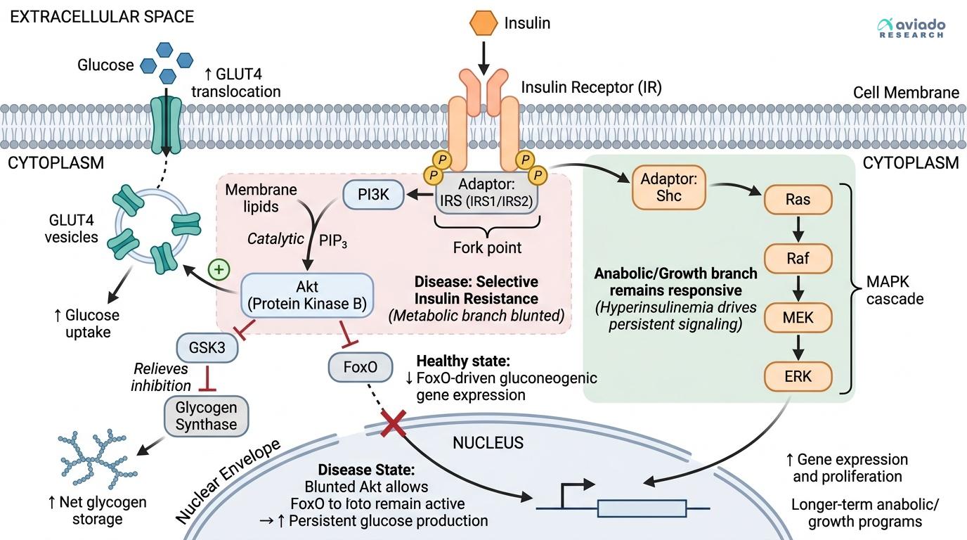
2) Akt outputs are broader than the three listed. Akt has multiple downstream targets affecting protein synthesis (via mTORC1), lipid metabolism, and cell survival. We spotlighted GLUT4, glycogen storage, and FoxO because they map cleanly to the 101 outcomes (glucose uptake, storage, and hepatic glucose production) [3].
3) MAPK is not “the cancer pathway,” and insulin is not a pure growth factor. Ras–MAPK signaling is a normal, regulated route used by many receptors to adjust gene expression and cell state. Insulin can engage it, but the magnitude and context differ by cell type and receptor abundance.
4) Feedback and “insulin resistance mechanisms” are real circuitry. Serine/threonine phosphorylation of IRS proteins, phosphatases that remove phosphates, and lipid phosphatases that remove PIP3 (e.g., PTEN) can all reduce signaling throughput. These feedbacks help explain how chronic nutrient surplus or inflammation can dampen the metabolic branch.
5) Timing is different across branches. The metabolic branch contains fast steps (vesicle trafficking) that can act in minutes, while MAPK-driven gene expression changes typically unfold over longer timescales.
6) Cells don’t run on insulin alone. Nutrient-sensing pathways, inflammatory signals, and other hormones/growth factors cross-talk with these nodes, so the same insulin input can produce different outputs depending on the cellular “state.”
Bottom line: the Y diagram is a teaching map that captures major traffic flow, not every street and traffic light in the city.